
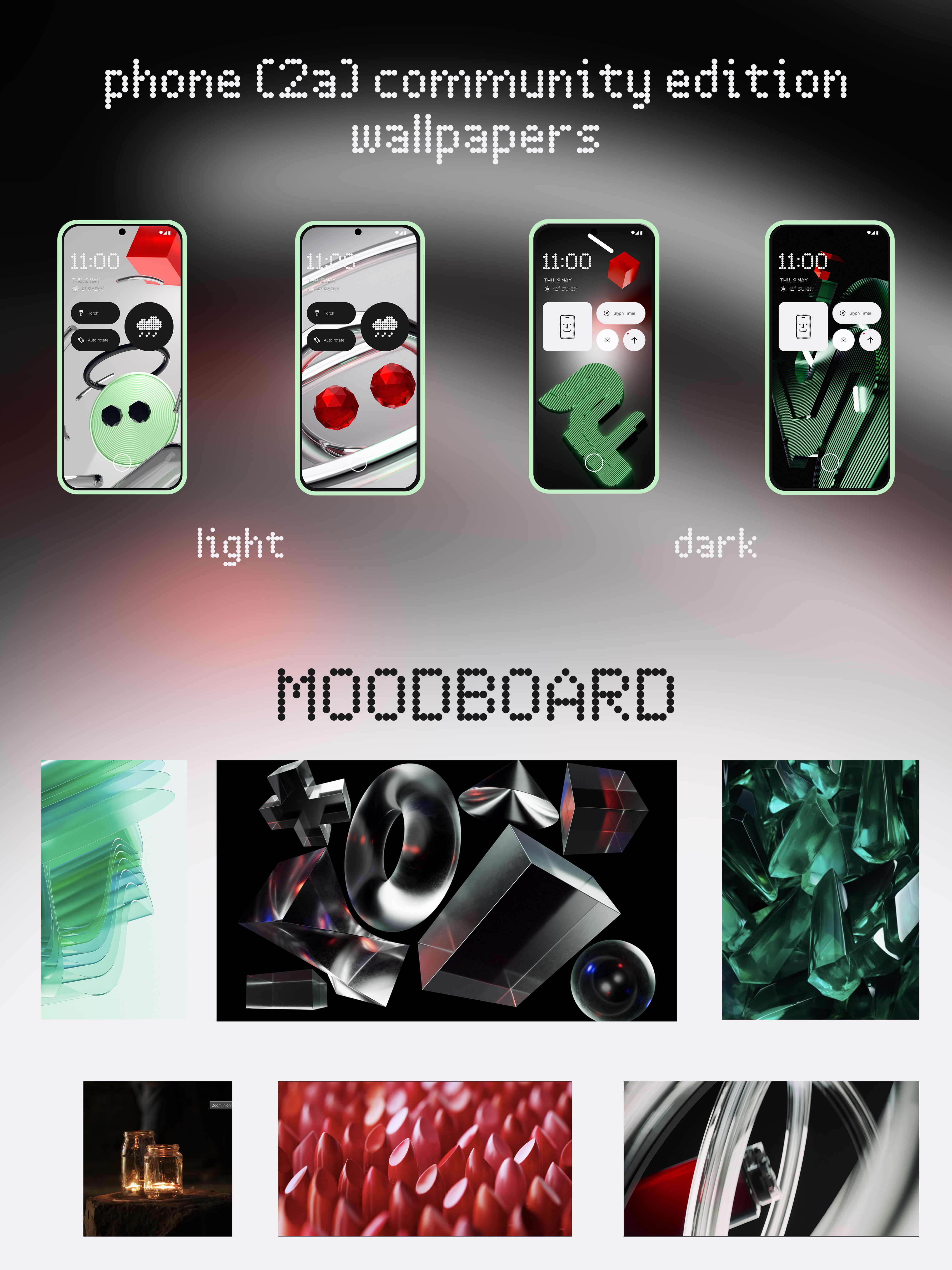
Nothing Phone (2a) Community Edition
Wallpaper Design
Project gallery
Finalized sketches
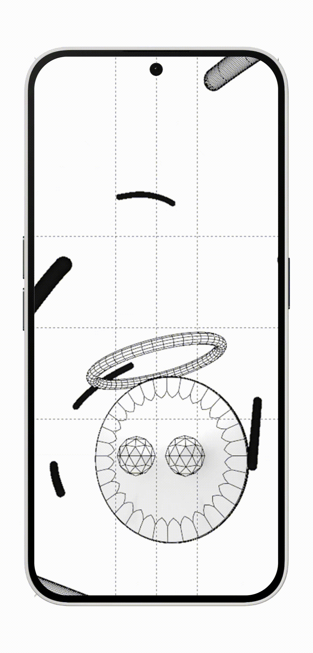
Wireframes
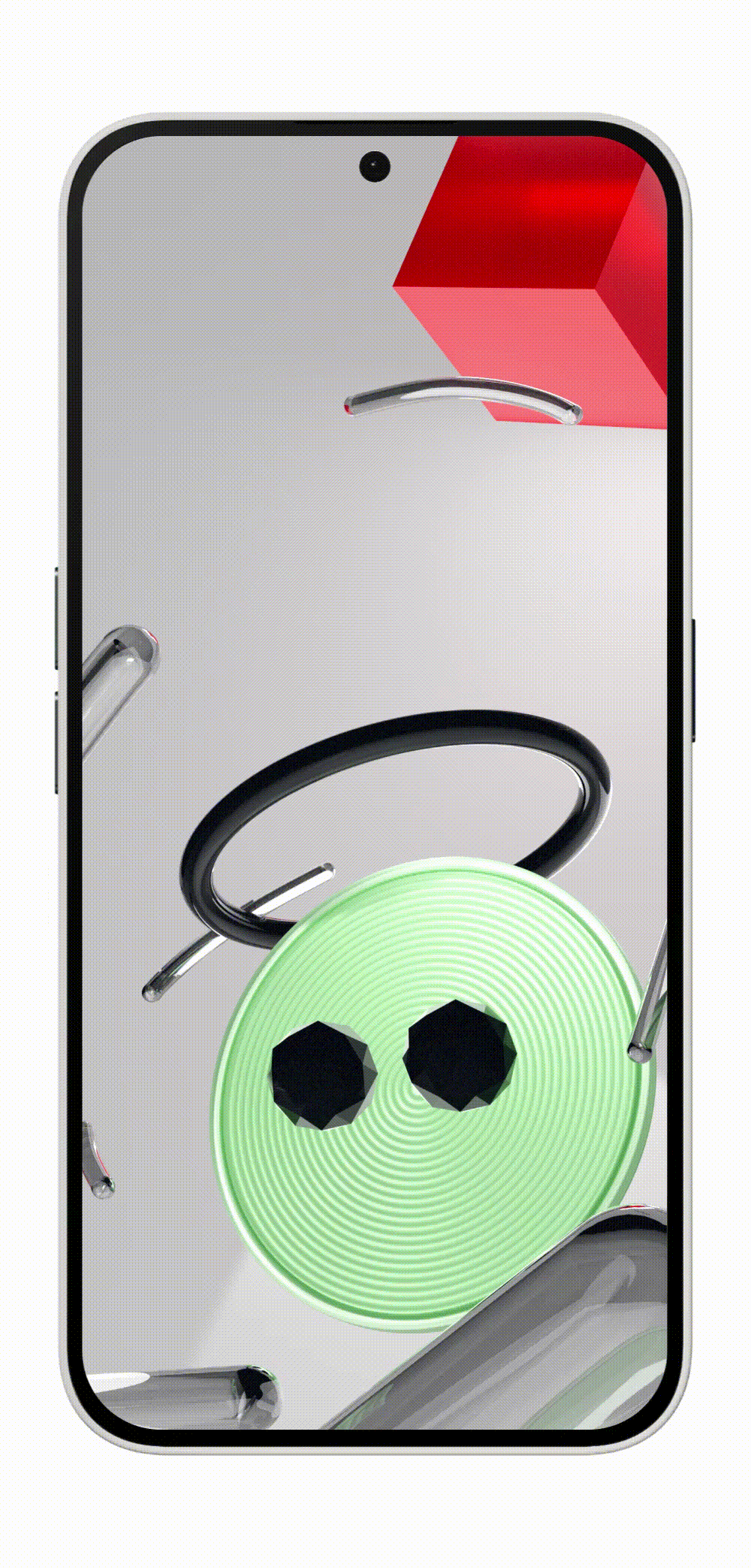
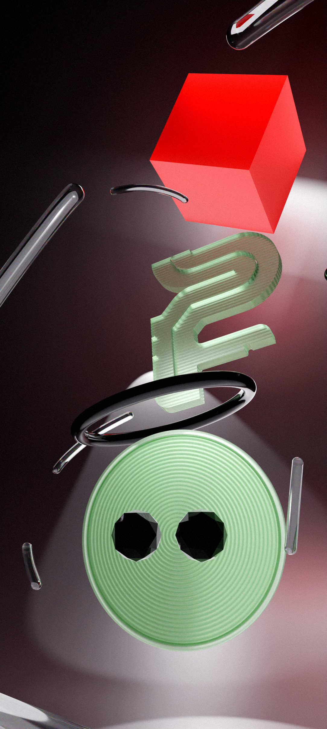
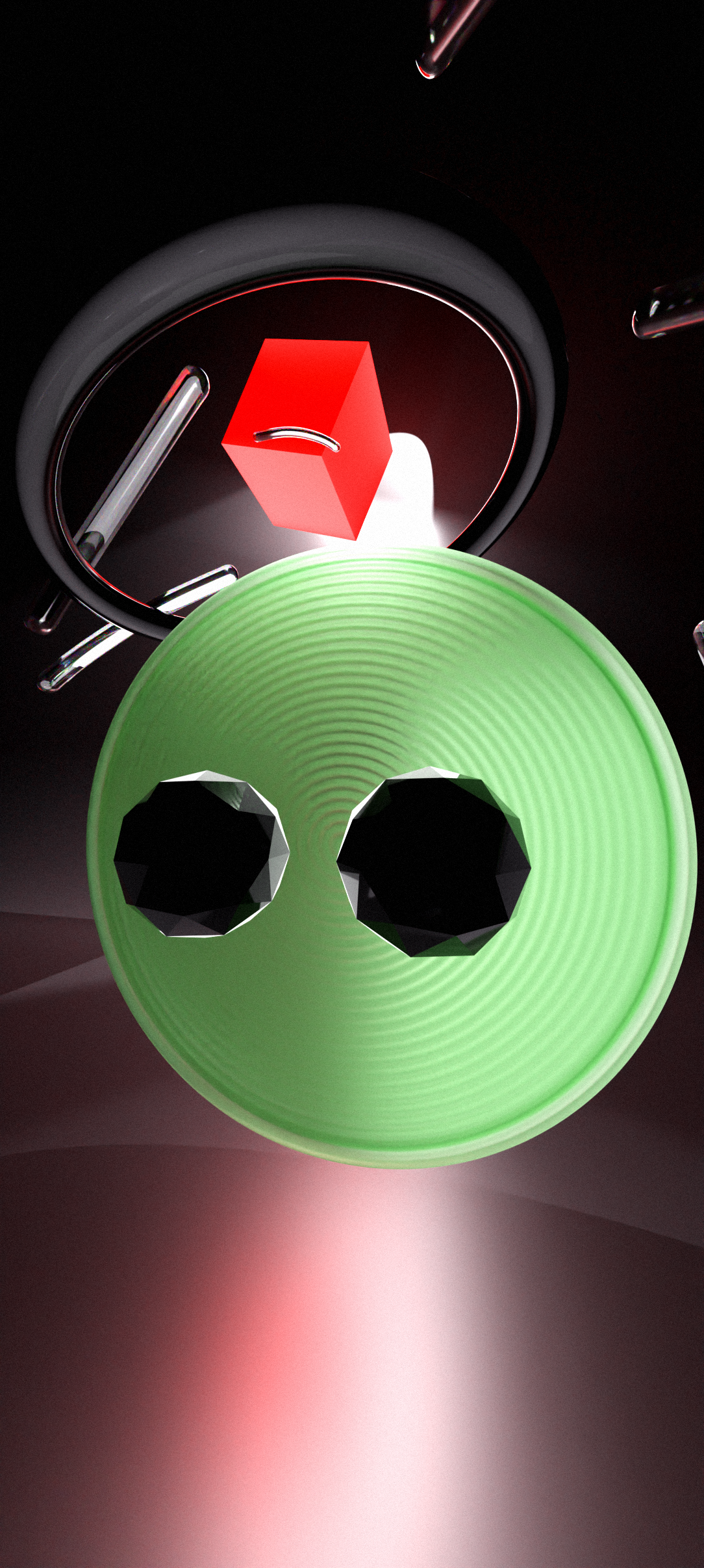
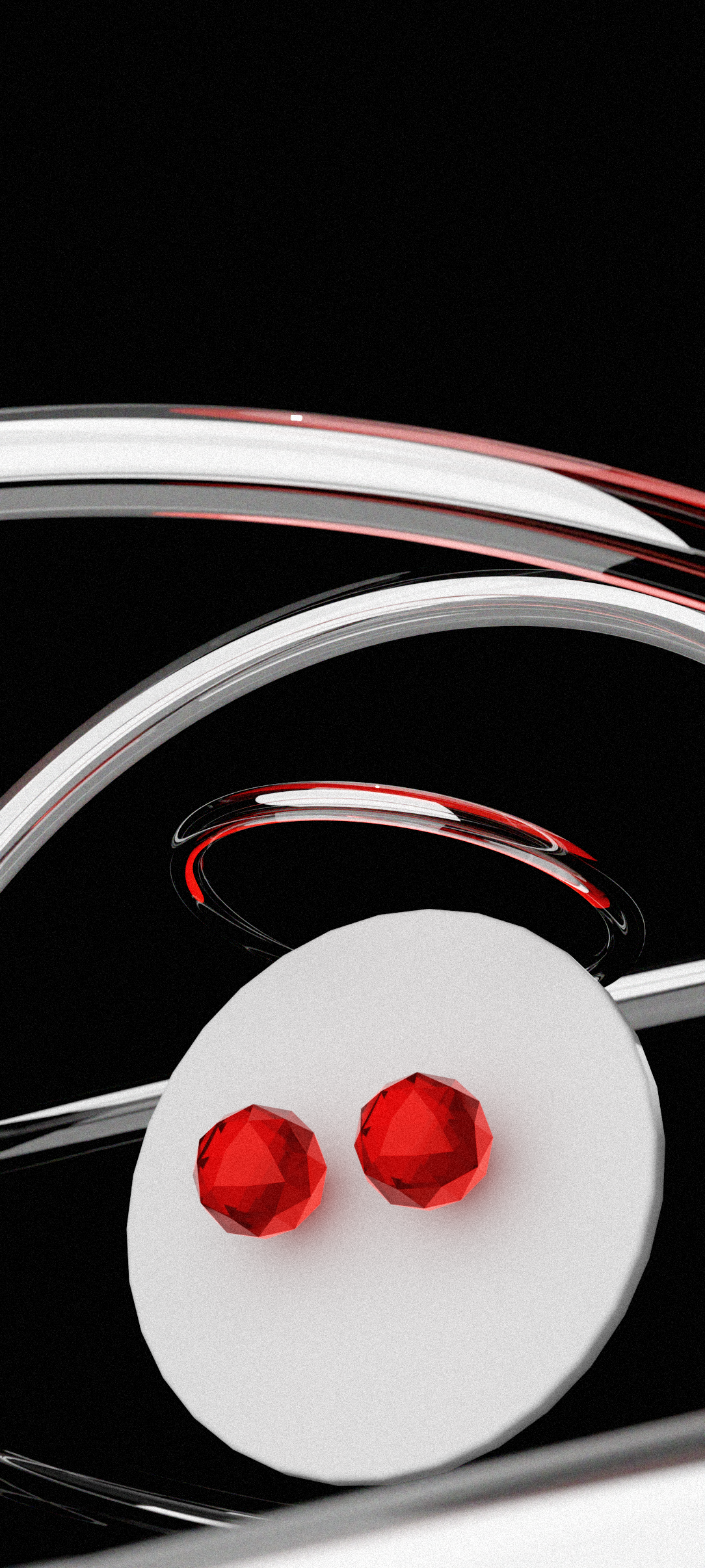
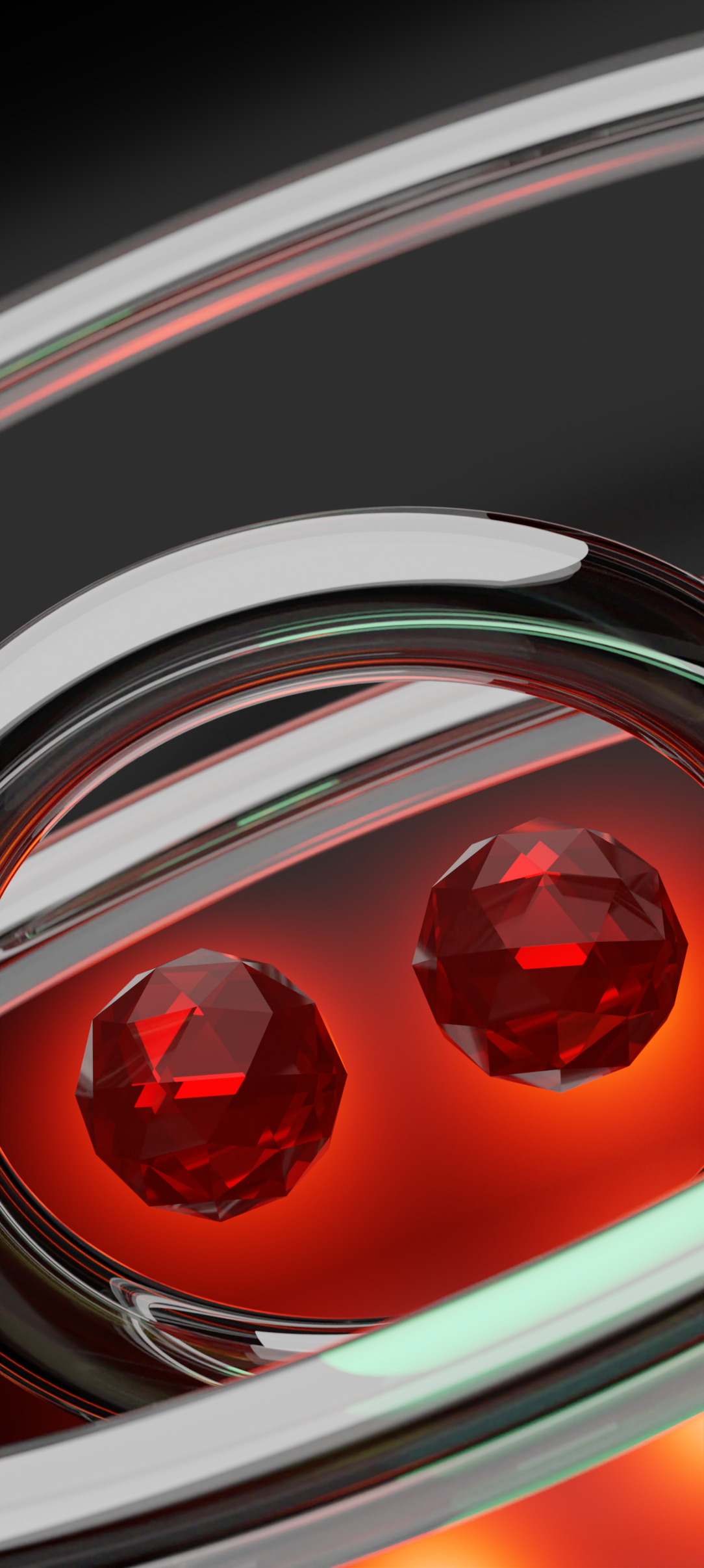
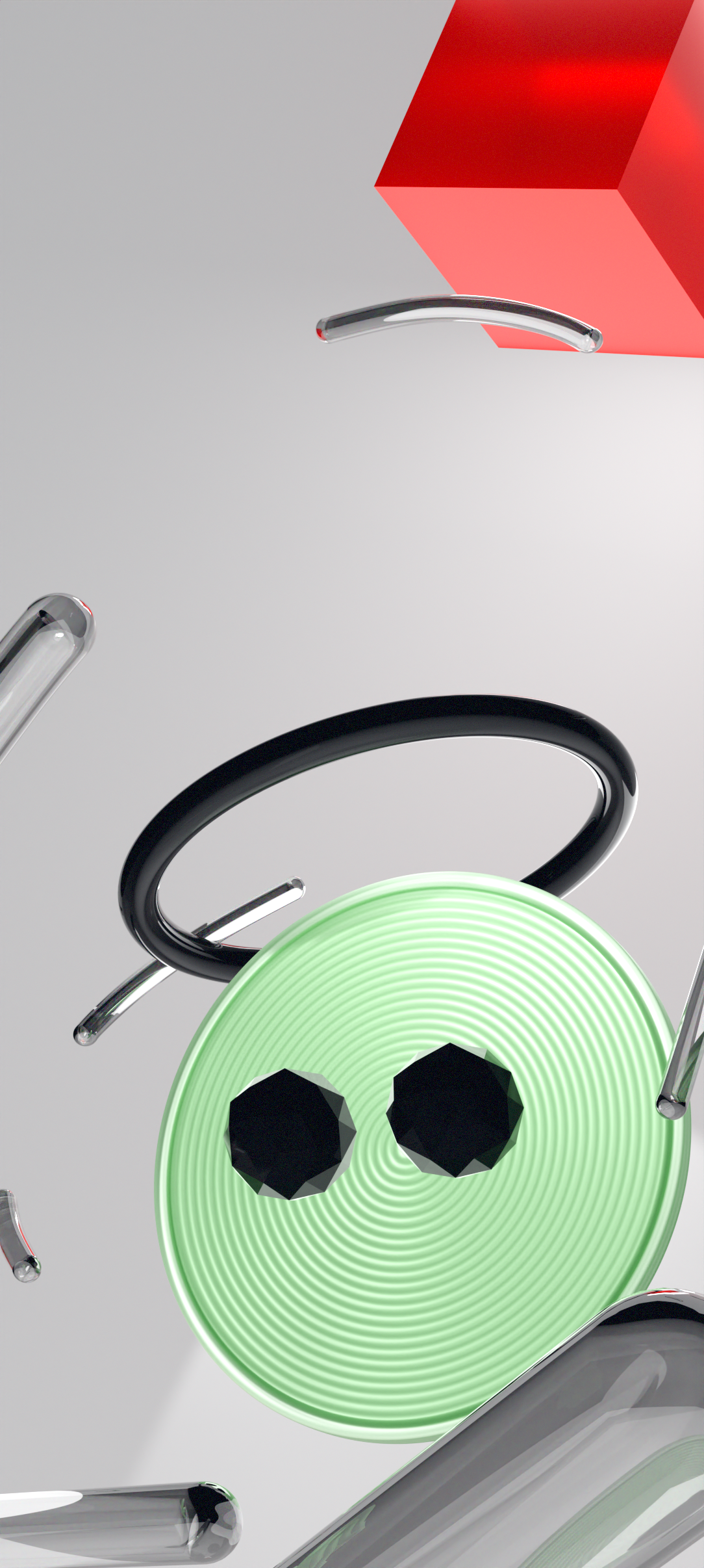
Final Wallpapers
Overview
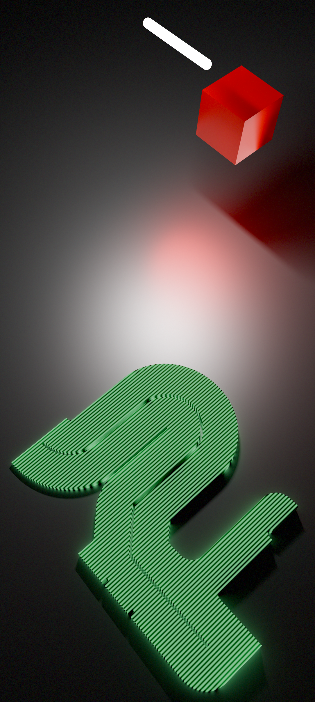
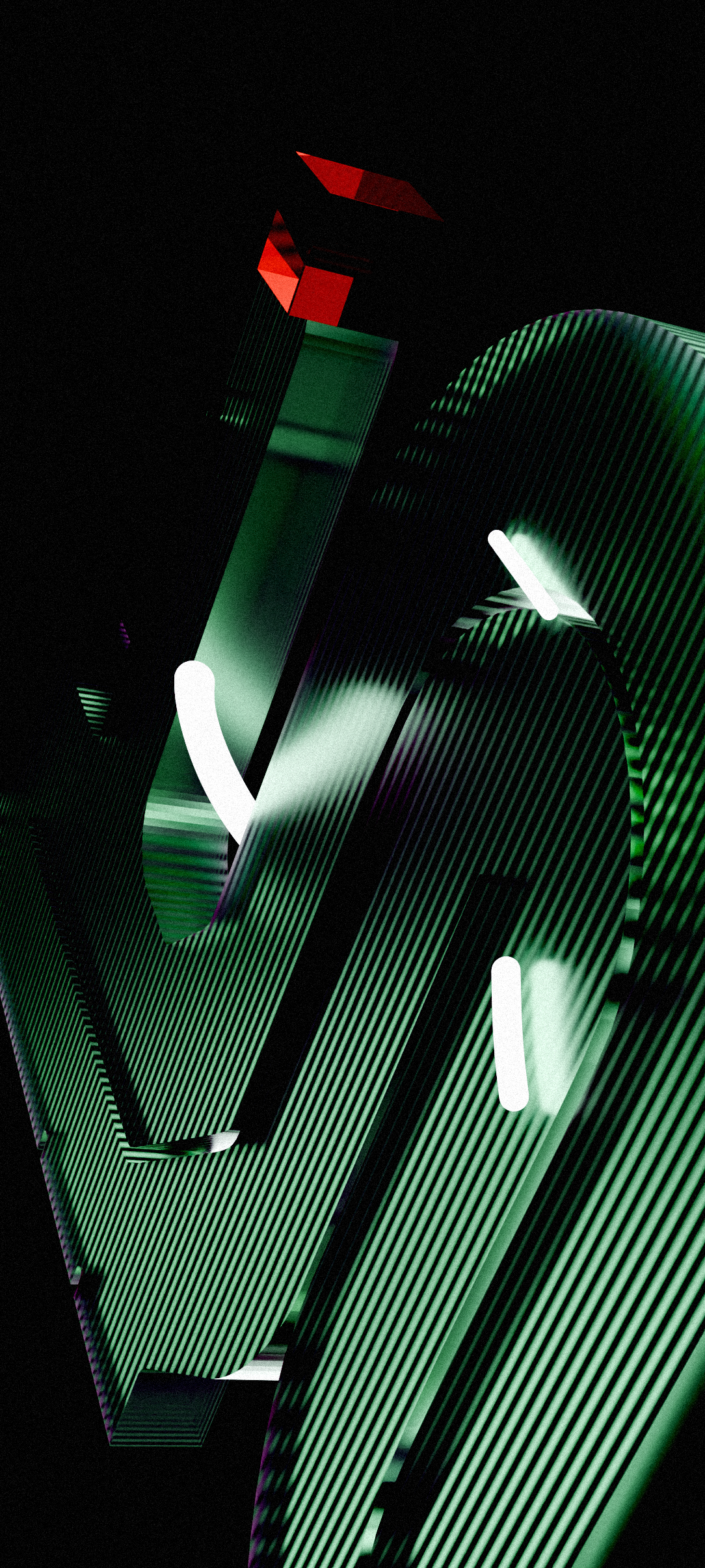
I've worked on making a collection of four wallpapers for the Stage 2 of Nothing Phone (2a) Community Edition.
I used Blender for the core images and Photoshop for post-processing, and designed these wallpapers to my fullest efforts for a couple of weeks.
The often overlooked back panel of Phone (2a) possesses a distinct character, one that I believed deserves more recognition. Through my wallpapers, I aimed to shed light on this aspect, presenting it in a very stylized manner that reflects the dynamic and innovative spirit of the Nothing Community.
Stage 2 Submission
Extending the ideas introduced by stage 1 winners Kenta and Astrid, I incorporated glossy and transmissive materials to enhance the phosphorescence concept, and seamlessly blending it with Nothing's transparent design ethos. In the light-themed pieces, metallic silver materials and the use of icospheres evoke a sense of "engineering feel" - a concept inculcated in the phone design by the stage 1 winners. Each design also incorporates the signature neon red accent color in different lighting conditions, adding vibrancy and coherence across the collection.
Brief
Design a series of four wallpapers that seamlessly integrate with the winning hardware design. How can the colours, patterns and shapes on display at the front of the phone continue the story being told at the back? Think of these as a collection or series, where each design is different but are clearly a part of the same group.
Cohesion with the winning hardware design
• We’re looking for a seamless journey from the moment people unbox Phone (2a) Community Edition to when they first turn it on. Think about how the theme incorporated on the back of the phone can influence the wallpapers on display at the front. The whole product experience should feel as one.
You can refer to the winning submission of Stage 1: Hardware Design.
UI elements
• Take Nothing OS’s UI elements into consideration. Objects like the status bar, fingerprint sensor overlay and clock will remain clearly visible on top of your wallpapers. With this in mind, we don’t want your wallpapers to embrace UI elements by, for example, outlining them. Focus on creating distinct wallpapers that create a unique feel and atmosphere, rather than distract from the functional elements on screen.
Keep it simple
• A wallpaper should complement the device's interface. Too many details or repetitive shapes can impact usability.
Challenges
Being a generalist, I have relatively limited experience in wallpaper design. Also, this was my first time working with 3D for wallpapers. So initially, I missed to keep the composition several times, and eventually had to scrap them. Despite that, I adhered to established creative processes, ensuring that each piece met the criteria outlined in the brief
Too chaotic
for a Wallpaper
Missed the layout
constraints
Out of brief
Ugly
Overcoming challenges
I iterated the compositions, camera settings and the lighting setups to come up with much more cohesive, legible and perfect-for-wallpaper designs, although these are not flawless.
Fits the layout,
simpler composition
Minimal & cohesive

Considered some
brighter choices
Dynamic perspective
Learnings and Takeaways
Although I couldn't win the competition, there were a lot of valuable takeaways and learnings over this whole course. Specifically, ones related to project management and 3D workflows. I got to understand the fundamentals of wallpaper design.
After my submission, I've gone through all the submissions, of which one from Derren stood out, who also seems to be an active member in the Nothing Community. Shout out to him!